The 2 Imperatives of Vinyl Hoarding Skins (Part 1): Design

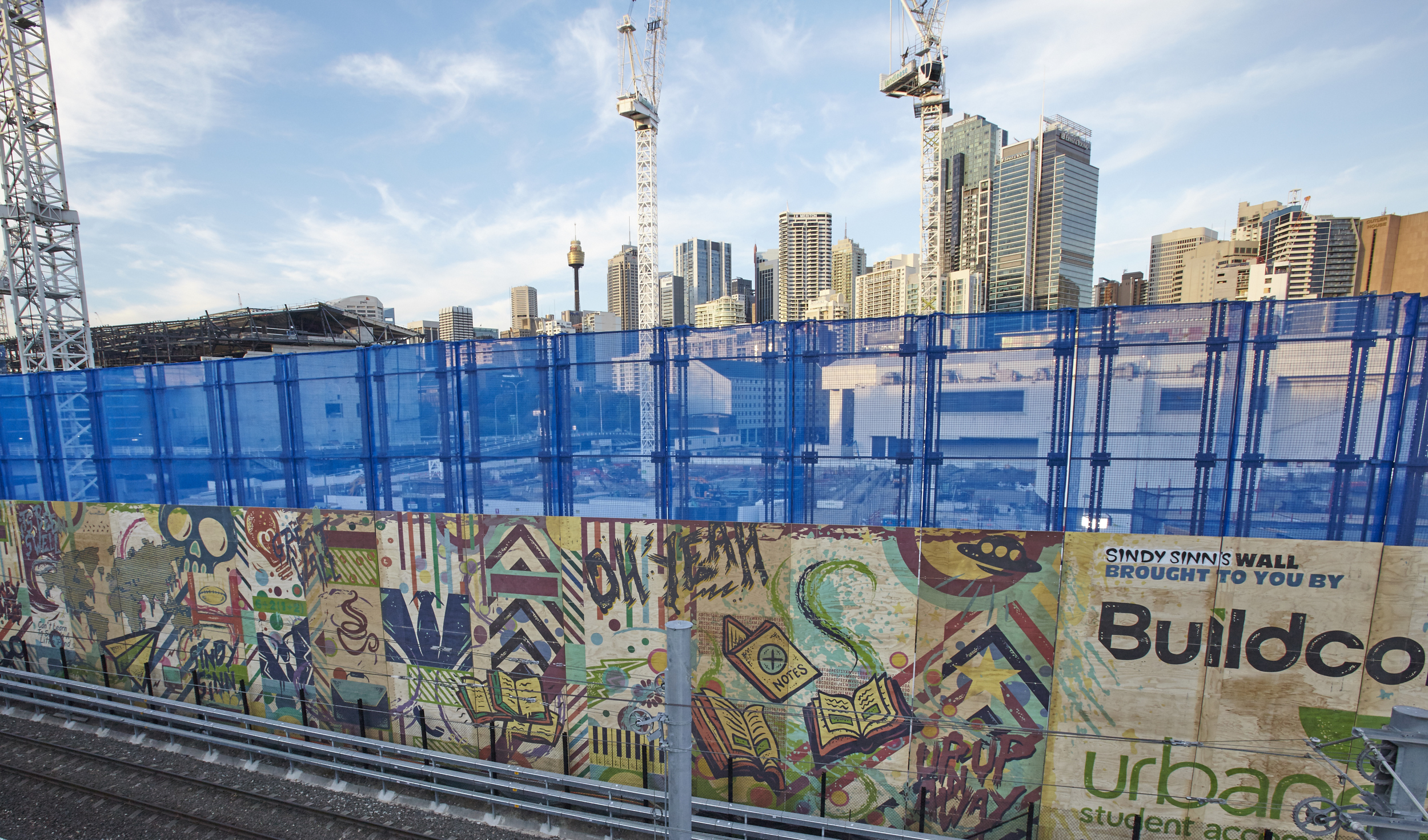
In the Construction Industry there is a requirement to keep pedestrians safe and re-direct human traffic across footpath facing site elevations in a thoughtful and efficient way. In most cases, using Type A and Type B hoardings completes this.

Hoardings can become quite ugly, are not thoughtfully constructed, and don’t quite use the ‘blank space’ across the frontage of the site effectively.

Here are is the first instalment of the 2 imperatives for making an otherwise boring brutalist hoarding into an informative, artistically pleasing, branded and cleanly installed point of engagement.

Design

Simply being there visually is an advantage. Let’s take a look at a few numbers to better understand why visuals in design are important:

  • It takes 13 milliseconds to see and form an interpretation of an image – whereas 60 seconds is the average time it takes to read 200-250 words.
  • 50% of your brain is involved in visual processing
  • 70% of all your sensory receptors are in your eyes
  • Microsoft has conducted research showing that we have as little as 10 seconds to clearly communicate a proposition to gain engagement
  • Wharton School of Business found a 17% uplift in engagement when a verbal only presentation was supported by images

Why are images so important? It’s all down to how our brains process information. Let’s keep it simple, and talk about why images are more important than words.

“A sentence is a collection of symbols, which when combined, conveys meaning.
An image is just one symbol that conveys meaning.”

Images are faster to process, faster to understand, easier to engage.

If you’re already in the construction phase – you’ve already got all the elements you need to complete an awesome design. Look back at your architectural renders, conceptual interior photos, jump on iStock or Getty to find additional images. Be sure that the images align with your target market as something that they desire or aspire to be. This imagery will set the platform and gain the initial attention of your pedestrians.

Only support using text, keep it simple, and say it how it is. Lists and point form are great ways of separating ideas, ensuring your message is clear and undiluted. If it’s residential, try to avoid price, if it’s commercial, add value in simple terms. Technology is our best friend – direct them to a website. Or, let the sales people do the selling via phone or in a meeting.

Oh, and don’t forget your brand, website, and contact details.

Made Agency based in Sydney nail visually engaging and informative designs

Made Agency based in Sydney nail visually engaging and informative designs

You should now be a professional at creating engaging designs – but if you ever need a hand or some insight, or someone to do all the work for you, get in touch with us and we’ll be more than happy to complete the design, print, and installation, start to finish. We love it.

Project Insights: Next Living Head Office

Next Constructions has been growing rapidly with the Tier 3 building category, and it’s easy to see given they’ve been listed in the BRW fast 100 every year consistently since 2011.

Their heavy investments in Tier 1 business management systems have more than supported their current work and operations, projecting them ahead of their targets for the coming years. Turning over in excess of $45 million in F16, and with $50 million in projects in the pipeline (comprising of 60% construction, 40% fit out), making them a force to be reckoned with in the NSW construction market place.

ScrimWorks have been a proud partner of Next for over 3 years. Working with Next has always facilitated the culmination of new ideas and innovations, allowing their projects to be a cut above the competition, in turn empowering ScrimWorks creatively to conjure unique solutions that leave both Next and the end user more than satisfied with projects completed on-time and defect free; every time without fail.

While Next have been busy looking after projects out in the marketplace, they’ve had internal projects they have been managing sequentially. Amazingly they have managed a complete move of the business from Wentworth St in the Sydney CBD, over to a more suitable office for growth on Goulburn St. This new space has been very deliberately engineered and customized to be a unique and open environment for their team; and to add the finishing touches on such a space Next could not look past ScrimWorks for our creativity and expertise in interiors.

Looking at the space, consulting with the Construction Manager Hussein Sheeth, and the Marketing Manager Nada Andrews, ScrimWorks set out to build a creative concept which would both support and compliment the existing interior, while also highlighting the work and capabilities of Next; something that their team could appreciate, supporting their achievements, and bringing the team together collectively.

There were four phases to the concept: examining the space, image selection, artwork creation and material selection.

Examining The Space

The office décor and design exudes a dark, classy and bespoke theme with black powder coated frames for the glazing work brass accents warming up the space, glossy reflective surfaces bestowed to bounce light around the space and dark grey/indigo carpets to contrast the brighter elements.

ScrimWorks spent a number of hours within the Next office brainstorming the light in the office, how the light moves, it’s origin, and how the different spaces in the office are used. The windows running across from the board room, executive offices and through the breakout area/kitchen project a significant amount of light spilling into the main area, which could be utilized creatively – it was ScrimWorks realization to harness this, creating a light-box like effect to give the impression the images across the glazed dividers were glowing, where it was necessary to create a finish in the Boardroom that absorbed light rather than accentuated it. This formed the basis of the initial concept, shortly thereafter approved by the executive team who couldn’t wait to see the initial designs.

Next CEO Joseph Di Girolamo in front of the MelWay custom wall graphic produced by ScrimWorks

Next CEO Joseph Di Girolamo in front of the MelWay custom wall graphic produced by ScrimWorks

Image Selection

Knowing that a lot of light lived bouncing around the office, it was important find images for the glazing that could synergize with the desired effect. Examining a portfolio of images alongside Nada and Hussein, the favorites were selected from some of their largest projects, projects they were proud of and that they could share not only amongst themselves but with any one. Talking points for insightful discussions.

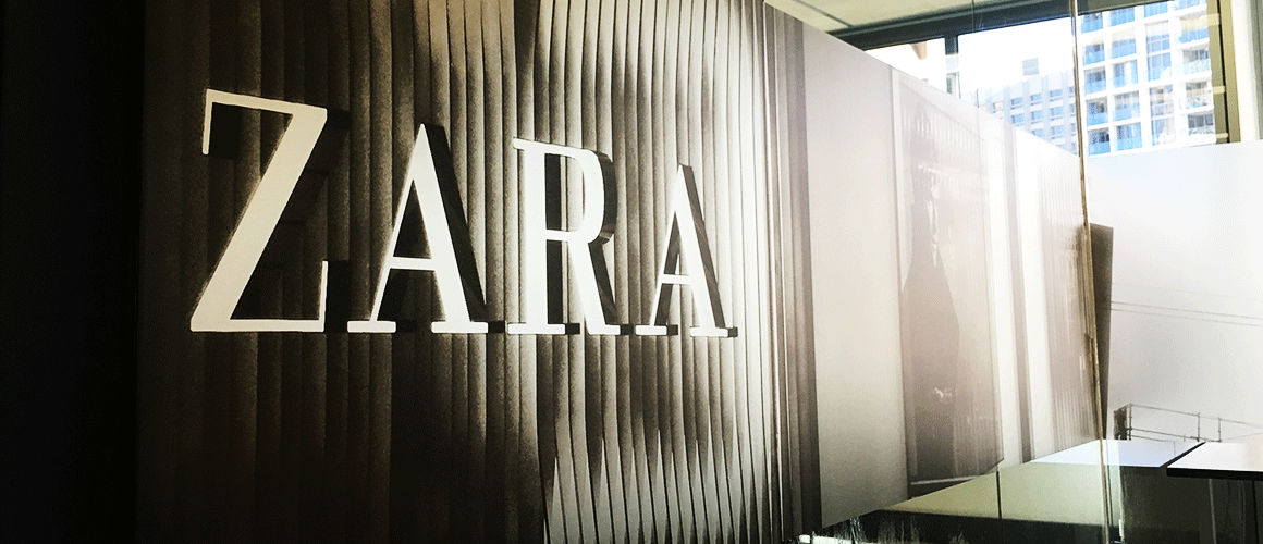
Some of the projects included were Zara Pitt St, Edge Ultimo, Arnott’s North Strathfield, Caltex Seven Hills and others, showing their technical abilities across their core business Construction, Fit outs and Refurbishment.

The Boardroom image, however, encroached into the seemingly impossible. A massive 7 x 3 meter map of Greater Sydney. In design and print, to achieve a clear image a ‘vector’ format is required, and with the amount of detail desired by the Next Executive Team, this would not be an easy image to obtain.
After cannonading several sources such as the City of Sydney Council, US map-making companies, and a myriad of local business, the Avalon was found with Melway – the files were obtained with incredible detail and a resolution that could be scaled infinitely. The perfect solution.

Edge Ultimo and others made the image cut

Edge Ultimo and others made the image cut

Artwork Creation

Knowing that the interior’s glazing creative hinged on being able to manipulate light for a desired effect, a series of Adobe programs were employed to make sure every element possible was harnessed to accentuate what would make this interior unique.

Following on the dark and raw themes of the new fit out and décor, it was decided that a half-tone effect should be used to create a grainy and obscured texture, creating images that were engaging and interesting, rather than just a photo on a wall.

The first step was to make edits to the original images, accentuating certain colorus (particularly whites and blacks) to essentially blow out the images, usually a big ‘no no’ in a photographic sense, but the final image was in sight, and this was merely a stopgap. Other edits were made such as editing out people, changing the sky, and adding in branding elements into various shots.

The images were then converted into a Grayscale format, erasing all of the colour profiles and leaving only the most basic gradients. This is where the glow effect really came into it’s own. Bitmap became the next conversion, which flattened the images again but into a complicated textured dot pattern. The only colour left at this stage was black, any other shade is simply only ‘perceived’ through expanded or contracted dot patterns.

Following this, and the final treatment was moving the images into Illustrator, and converting all of the black dots into CMYK and subsequently altering this breakdown into rich black – meaning the printers could throw a base of Cyan, Magenta and Yellow forming a grey at first; when finally covered in black this creates a depth and consistency that a standard 100% black coat cannot produce.

The print process of the Boardroom was much simpler – standard colours that were true to the original map were decided to give an authentic feel that most viewers would be familiar with. These blues, greens, reds, greys and yellows successfully complimented the various elements of the map, and accentuated the sheer scale of the area it portrayed – over 2000km2 of Greater Sydney.

Photoshop and Illustrator were used to edit and produce the final images

Photoshop and Illustrator were used to edit and produce the final images

Material selection

The prime directive of the concept was to convert hard exterior and interior lighting into a soft glow, which ruled out a lot of laminates, conveniently. The best way to complete this effect successfully was to employ an optically clear substrate for print, which would in turn allow the laminate to filter out light to produce the effect, for this we used a diffuser laminate from Avery, more commonly used for light box signage you might see out the front of a clothing store or restaurant – only instead of having LEDs or Fluro lights illuminating the design, natural light would create our effect. By using optically clear SAV we could allow more light than usual to hit the diffuser for a cleaner effect.

As the Boardroom is flooded with natural light throughout the day, it was appropriate to select a clean matte laminate to absorb the light so the artwork could be viewed at any time of day with the clarity and detail that the image commanded. Again, Avery had just the right product. Printed onto a Cast White Self Adhesive Vinyl in stunning 1200dpi resolution, the laminate was then screened over the top creating a smooth finish that ticked all of the boxes given the tricky environment in which the print would be viewed.

Although the creative process was quite lengthy from inception to completition, it was very important that Next and ScrimWorks partnered on a quality finish that would not only help to feature and foster the core ideals of Next as a business, instill empowerment and pride among those operating in the space, engage any external parties in an interesting and unique environment, but also create an astonishing finish lasting well into the future by using the highest quality materials available, and taking the utmost care in planning an installation to ensure that the interior can be enjoyed as the business continues to grow.

Avery Dennison products look great, print fantastically and last a very long time

Avery Dennison products look great, print fantastically and last a very long time

After and very lengthy and involved creative and production process, using the combined minds of ScrimWorks and Next Constructions, a one of a kind interior was achieved with the highest quality materials, definitely something not commonly seen in the marketplace. The best solutions do take time, and ScrimWorks get no greater joy than ensuring our clients have something unique that they can be proud of.

A completed panel featuring the Zara Flagship store in Sydney's Pitt St Mall

A completed panel featuring the Zara Flagship store in Sydney's Pitt St Mall


Is it Clear Who We Are? The Importance of Branding in the Construction Industry.

As we can all acknowledge, building sites can be visually dirty, cluttered, and complicated environments, especially if you do not work in the trade. Contrary to their image, they are extremely highly organized projects that are a culmination of intense planning, development and structure well before a pedestrian can identify that a site has been acquired.

So the question then becomes, with all of the planning, engineering and research going into your site, why would you allow your development to be poorly represented and maligned with your core business and brand?

The short answer is that it shouldn’t be. Like the building site that is physically forming under foot, the brand is equally as tangible, however forming in the mind.

Buildcorp and AMP Capital at Thomas Holt Drive, Macquarie Park

Buildcorp and AMP Capital at Thomas Holt Drive, Macquarie Park

This is where custom signage tailored to you brand comes into play – this can help build a professional, clean and organized image to the site, while also strengthening these important points:

·     Reinforcing alignment to the brand;
·     Drawing traffic to the website and supporting other initiatives;
·    Informing and Educating about the development and business;
·    Build engagement towards social media;
·    Providing pleasing images for pedestrians and public in the area;
·     Build a narrative which pedestrians can involve themselves in.

A key take out to support this, is that 65% of all audiences are visual learners, particularly in a streetscape environment the visual elements are highly important. Where Corflute informational signage, and ScrimMesh on the fences essentially work as billboard style outdoor advertising:*

·    67% of Australians have seen billboards in the past week;
·     88% say brands on billboards stand out;
·    72% of Australians travel on roads to and from work;
·    74% of Australians see billboards every day, several times a week.

What percentage of these individuals are seeing and engaging with you?

Woollam Constructions showing off their brand and image effectively through informational signage, printed on Rigid Poly.

Woollam Constructions showing off their brand and image effectively through informational signage, printed on Rigid Poly.

There are also effects internally. It provides and identity to the business and builds importance and trust within the brand with employees and subcontractors alike, where a vision and a standard can be shared.

Next time you make it out to site, have a look and ask ‘Does my site align to my brand? Is it clear who we are?” Contemplate how your site can look with custom branded Corflute HSE and Directional Signage, and consider how pedestrians and the community can engage with your project using branded and informative Fencing media – 88% of people say you can stand out more, and ScrimWorks is here to make it happen.

*Source: ooh!, Neuroscience 2011, The Seed, How we really travel 2009 | MOVE data 2013, Ppl 14yrs+ | Nielsen CMV Survey 1, 2013

Next Constructions have aligned all signage across all sites, to give uniformity and professionalism to their brand, supporting a strong and coherent image.

Next Constructions have aligned all signage across all sites, to give uniformity and professionalism to their brand, supporting a strong and coherent image.


TAKE A LOOK AT OUR MOST POPULAR CONSTRUCTION BRANDING SOLUTIONS