Having Fun With AluPanel (plus installation time lapse)

It's not often private residential projects come up, as the materials we generally produce aren't necessarily conducive to in-home applications. However once in a while something comes up where we can have a lot of fun in the design and installation, while also solving a problem.

In the case of this particular client, they'd had a new fence installed which did not fit the council regulations for safety around their pool. Additionally, having a 2 year old daughter made them very keen to have a solution put together that would brighten up their yard, be an interesting and unique addition to their home, while also ensuring the safety of their little one.

Custom installation around the glass pool fence

Custom installation around the glass pool fence

We went over quite a few options before deciding that AluPanel (also known as CompPanel, SkyBond, AluBond etc) would be the most cost effective and appropriate option.

During the design phase we had mocked up quite a few bright and visually pleasing concepts including a Moroccan tile motif, a Grotto type theme, before eventually agreeing that a repeating pattern which would tesselate with itself infinitely would be something simple and effective.

We worked with the client perusing iStock, Shutterstock and other photographic resources, when we stumbled upon the tropical bird repeating pattern - what a theme to go with their cabana style yard layout and pool area! Tropics in your home!

Close up of the repeating pattern

Close up of the repeating pattern

The installation presented it's challenges, however nothing some on-site customising couldn't solve. Anything is possible with the right tools and expertise.

You've seen the photos, now watch the video of the team! Music by Dave Hammer - https://soundcloud.com/hammerproducer

Campbell Arnott's New Culinary Centre Dressed-Up By ScrimWorks

Recently Next was awarded the construction of Campbell Arnott's Culinary Centre at their iconic head office site in North Strathfield which included a new 'Culinary Centre' featuring test and demonstration kitchens. This project also incorporated an employee breakout area with lounge, table seating and meeting spaces with the end goal of uniting staff within a common area for all in the facility to enjoy.

A major refurbishment of this scale, conducted in a live and operational environment, is a huge accomplishment. Entering into the design phase, morphing into construction, and subsequently completing and handing over the project all the while within a fully functioning facility is no easy feat. The results of the project show the intense planning, management and execution.

Contour cut Culinary Centre graphic upon entry made with glittery gold

Contour cut Culinary Centre graphic upon entry made with glittery gold

As alternative light was recommended by Next, a confronting architectural challenge ensued. The extension endured Herculean works to support a monstrous glazed façade and roof to allow not only the first floor of the building to be supported, but the immense amount of glazing to empower such a volume of light into the area.

ScrimWorks were trusted to head up the graphics side of this project, and after a single site visit the light permeation was an obvious theme within the space – with a glass roof and glass walls there’s no way you can miss it!

Our challenge involved no such mathematics or consideration; the decision was simply to harness the light to improve an image. The images were our challenge.
Partnering both Campbell Arnott’s and Next, we were able to design and execute a heritage themed series of graphics paying homage to the businesses legacy, while acknowledging a modernised and technical space.

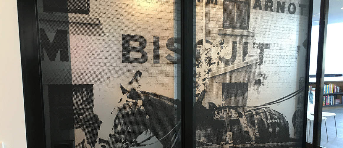
The glow of natural light permeating through the backlit material of the Operable Wall

The glow of natural light permeating through the backlit material of the Operable Wall

For the “Operable Wall” (a fully mobile wall separating the new Culinary Centre and the Breakout Area), we decided on two heritage images from the birth of the businesses – horses and carts. Heritage photographs are typically difficult to work with due to resolution issues, however half toning provides unlimited potential. We used the same concept for the Breakout Area wall which you can see a video of below – however a blown up and half toned photograph of one of their original production facilities in Newcastle Australia, also with their team at the time lined up out front! A very rare image. This provided a stylised aesthetic, which brings the grassroots family aspects of the beginnings of the businesses forward into a new common area that everyone can enjoy in modern times.

Staff member 'crew photo' in a half tone design featured in the Breakout Area

Staff member 'crew photo' in a half tone design featured in the Breakout Area

There was also a feature floor graphic as part of the main Staff Area. Arnott’s suggested a vintage tin lid with a relic design on there from their archives, a very cool idea. We were very careful having this artefact professionally photographed by product photography specialist Roman Wolczak. The colours came up ultra vibrant after some quick re-touching at the ScrimWorks Studio, and we were ready to lay it down! 

Professionally photographed antique biscuit tin for the floor graphic

Professionally photographed antique biscuit tin for the floor graphic

Materials used were all top quality from Avery Dennsion, of course – ranging from a matte laminated backlit film for the Operable Wall (to give the light through the glazing a warm glowing effect), a matte laminated permanent SAV for the Breakout Area, and a permanent SAV with a special non-slip laminate for the floor, ensuring safety and a lasting finish.

Take a look at the photographs throughout the post, and take a look at the video to see ScrimWorks installation process for this project.

ScrimWorks demonstrating a swift installation of some printed Self Adhesive Vinyl at the Arnott's head office. What you don't see is where we have painted the wall with a prep coating which ensures the adhesive on the substrate sticks to the wall for years to come.

The 2 Imperatives of Vinyl Hoarding Skins (Part 2): Installation

In our first instalment, we looked at the importance of design in engaging pedestrians, and drawing interest into your imagery and messages, creating an important marketing tool for your business and development.

Installation is so important to the image of the brand and the message that it’s conveying – developments obviously cost considerable amounts of money, so you’d be out of your mind to misrepresent, or settle for second best.

Here is the second instalment of the 2 imperatives for making an otherwise boring, brutalist hoarding into an informative, artistically pleasing, branded and cleanly installed point of engagement.

All you’ll need is a good Impact Driver, as many fixings for one every 500-1000mm, a tape, and a pry bar. Here’s how:

Pry Bar, Impact Driver, Fixing Bits, Hex Head Metal Tek Screws are all you need.

Pry Bar, Impact Driver, Fixing Bits, Hex Head Metal Tek Screws are all you need.

  1. Ensure you’ve gotten your measurements correct! Check the height of the Hoarding, and how the Vinyl Skin is going to fit on (don’t forget we need to allow a little extra space top and bottom to fit our sail track extrusion)
  2. Run your first length of sail track along the top of where the skin will run. You’ll only need screws or fixings around every 1000mm apart
  3. Take your skin, and run the top Kedar edge along the inside of the sail track, like a curtain (this is the fun part)
  4. Run the sail track along the bottom edge and let it sit there for a bit, you’ll come back to this later
  5. Run a length of sail track along a vertical edge of your choosing, and affix it to the hoarding, again fixings around 1000mm apart
  6. Move to the opposite end of the skin, and slide in the other vertical length of sail track. Pull it as tight as you possibly can using your pry bar by pressing the elongated end between the track and the skin, applying your weight to the curved end of the bar, using this for leverage and extra tension. Once it’s as tight as you can possibly go, take your fixing and go into the hoarding – screw on an angle to get a few extra millimetres of stretch. You should notice that the skin has ripples running horizontally along it’s length – if it doesn’t, you need to go tighter
  7. Working on the bottom, take your pry bar, and use the same technique just mentioned. Project your weight downwards, and angle your fixings downward as well. You’ll see that this is pulling out those horizontal ripples. You don’t want to over tension by putting too many fixings in though as this will create other ripples – less is more!
  8. If there are any residual ripples, experiment with your pry bar to see where you can put a fixing
  9. You’re done! If you do however see a few slight creases in the fabric (like an un-ironed shirt), don’t worry, some exposure to the sun will get those out.

Check out this time lapse of the ScrimWorks team using this technique for an amazing result.

You should now be a professional at design and installation – but if you ever need a hand or some insight, or someone to do all the work for you, get in touch with us and we’ll be more than happy to complete the design, print, and installation, start to finish. We love it.

The 2 Imperatives of Vinyl Hoarding Skins (Part 1): Design

In the Construction Industry there is a requirement to keep pedestrians safe and re-direct human traffic across footpath facing site elevations in a thoughtful and efficient way. In most cases, using Type A and Type B hoardings completes this.

Hoardings can become quite ugly, are not thoughtfully constructed, and don’t quite use the ‘blank space’ across the frontage of the site effectively.

Here are is the first instalment of the 2 imperatives for making an otherwise boring brutalist hoarding into an informative, artistically pleasing, branded and cleanly installed point of engagement.

Design

Simply being there visually is an advantage. Let’s take a look at a few numbers to better understand why visuals in design are important:

  • It takes 13 milliseconds to see and form an interpretation of an image – whereas 60 seconds is the average time it takes to read 200-250 words.
  • 50% of your brain is involved in visual processing
  • 70% of all your sensory receptors are in your eyes
  • Microsoft has conducted research showing that we have as little as 10 seconds to clearly communicate a proposition to gain engagement
  • Wharton School of Business found a 17% uplift in engagement when a verbal only presentation was supported by images

Why are images so important? It’s all down to how our brains process information. Let’s keep it simple, and talk about why images are more important than words.

“A sentence is a collection of symbols, which when combined, conveys meaning.
An image is just one symbol that conveys meaning.”

Images are faster to process, faster to understand, easier to engage.

If you’re already in the construction phase – you’ve already got all the elements you need to complete an awesome design. Look back at your architectural renders, conceptual interior photos, jump on iStock or Getty to find additional images. Be sure that the images align with your target market as something that they desire or aspire to be. This imagery will set the platform and gain the initial attention of your pedestrians.

Only support using text, keep it simple, and say it how it is. Lists and point form are great ways of separating ideas, ensuring your message is clear and undiluted. If it’s residential, try to avoid price, if it’s commercial, add value in simple terms. Technology is our best friend – direct them to a website. Or, let the sales people do the selling via phone or in a meeting.

Oh, and don’t forget your brand, website, and contact details.

Made Agency based in Sydney nail visually engaging and informative designs

Made Agency based in Sydney nail visually engaging and informative designs

You should now be a professional at creating engaging designs – but if you ever need a hand or some insight, or someone to do all the work for you, get in touch with us and we’ll be more than happy to complete the design, print, and installation, start to finish. We love it.

Project Insights: Next Living Head Office

Next Constructions has been growing rapidly with the Tier 3 building category, and it’s easy to see given they’ve been listed in the BRW fast 100 every year consistently since 2011.

Their heavy investments in Tier 1 business management systems have more than supported their current work and operations, projecting them ahead of their targets for the coming years. Turning over in excess of $45 million in F16, and with $50 million in projects in the pipeline (comprising of 60% construction, 40% fit out), making them a force to be reckoned with in the NSW construction market place.

ScrimWorks have been a proud partner of Next for over 3 years. Working with Next has always facilitated the culmination of new ideas and innovations, allowing their projects to be a cut above the competition, in turn empowering ScrimWorks creatively to conjure unique solutions that leave both Next and the end user more than satisfied with projects completed on-time and defect free; every time without fail.

While Next have been busy looking after projects out in the marketplace, they’ve had internal projects they have been managing sequentially. Amazingly they have managed a complete move of the business from Wentworth St in the Sydney CBD, over to a more suitable office for growth on Goulburn St. This new space has been very deliberately engineered and customized to be a unique and open environment for their team; and to add the finishing touches on such a space Next could not look past ScrimWorks for our creativity and expertise in interiors.

Looking at the space, consulting with the Construction Manager Hussein Sheeth, and the Marketing Manager Nada Andrews, ScrimWorks set out to build a creative concept which would both support and compliment the existing interior, while also highlighting the work and capabilities of Next; something that their team could appreciate, supporting their achievements, and bringing the team together collectively.

There were four phases to the concept: examining the space, image selection, artwork creation and material selection.

Examining The Space

The office décor and design exudes a dark, classy and bespoke theme with black powder coated frames for the glazing work brass accents warming up the space, glossy reflective surfaces bestowed to bounce light around the space and dark grey/indigo carpets to contrast the brighter elements.

ScrimWorks spent a number of hours within the Next office brainstorming the light in the office, how the light moves, it’s origin, and how the different spaces in the office are used. The windows running across from the board room, executive offices and through the breakout area/kitchen project a significant amount of light spilling into the main area, which could be utilized creatively – it was ScrimWorks realization to harness this, creating a light-box like effect to give the impression the images across the glazed dividers were glowing, where it was necessary to create a finish in the Boardroom that absorbed light rather than accentuated it. This formed the basis of the initial concept, shortly thereafter approved by the executive team who couldn’t wait to see the initial designs.

Next CEO Joseph Di Girolamo in front of the MelWay custom wall graphic produced by ScrimWorks

Next CEO Joseph Di Girolamo in front of the MelWay custom wall graphic produced by ScrimWorks

Image Selection

Knowing that a lot of light lived bouncing around the office, it was important find images for the glazing that could synergize with the desired effect. Examining a portfolio of images alongside Nada and Hussein, the favorites were selected from some of their largest projects, projects they were proud of and that they could share not only amongst themselves but with any one. Talking points for insightful discussions.

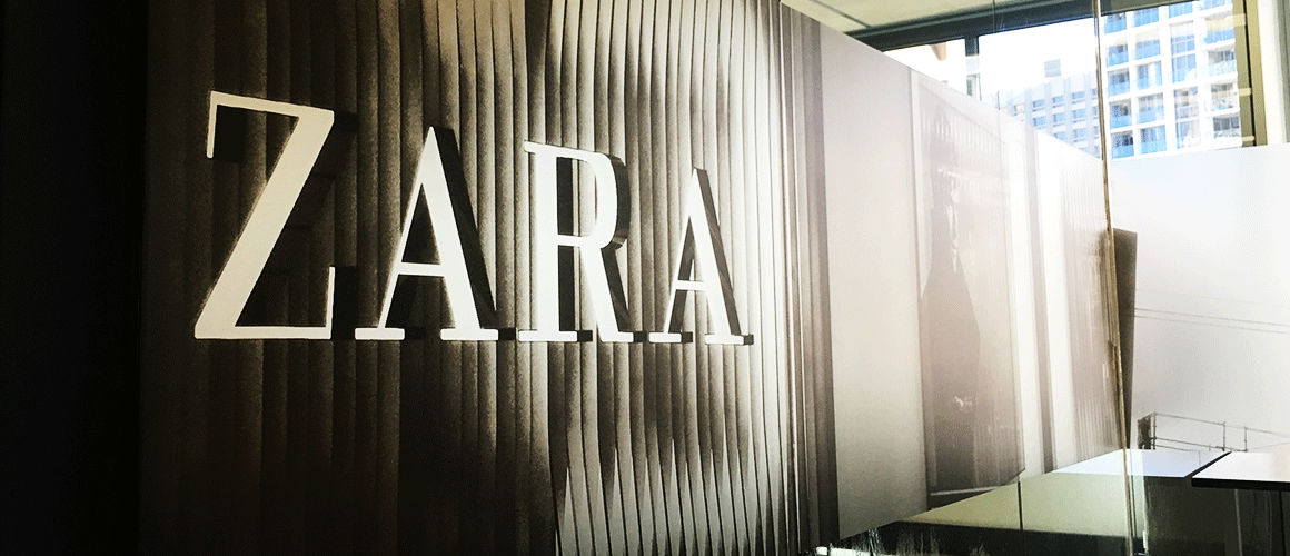
Some of the projects included were Zara Pitt St, Edge Ultimo, Arnott’s North Strathfield, Caltex Seven Hills and others, showing their technical abilities across their core business Construction, Fit outs and Refurbishment.

The Boardroom image, however, encroached into the seemingly impossible. A massive 7 x 3 meter map of Greater Sydney. In design and print, to achieve a clear image a ‘vector’ format is required, and with the amount of detail desired by the Next Executive Team, this would not be an easy image to obtain.
After cannonading several sources such as the City of Sydney Council, US map-making companies, and a myriad of local business, the Avalon was found with Melway – the files were obtained with incredible detail and a resolution that could be scaled infinitely. The perfect solution.

Edge Ultimo and others made the image cut

Edge Ultimo and others made the image cut

Artwork Creation

Knowing that the interior’s glazing creative hinged on being able to manipulate light for a desired effect, a series of Adobe programs were employed to make sure every element possible was harnessed to accentuate what would make this interior unique.

Following on the dark and raw themes of the new fit out and décor, it was decided that a half-tone effect should be used to create a grainy and obscured texture, creating images that were engaging and interesting, rather than just a photo on a wall.

The first step was to make edits to the original images, accentuating certain colorus (particularly whites and blacks) to essentially blow out the images, usually a big ‘no no’ in a photographic sense, but the final image was in sight, and this was merely a stopgap. Other edits were made such as editing out people, changing the sky, and adding in branding elements into various shots.

The images were then converted into a Grayscale format, erasing all of the colour profiles and leaving only the most basic gradients. This is where the glow effect really came into it’s own. Bitmap became the next conversion, which flattened the images again but into a complicated textured dot pattern. The only colour left at this stage was black, any other shade is simply only ‘perceived’ through expanded or contracted dot patterns.

Following this, and the final treatment was moving the images into Illustrator, and converting all of the black dots into CMYK and subsequently altering this breakdown into rich black – meaning the printers could throw a base of Cyan, Magenta and Yellow forming a grey at first; when finally covered in black this creates a depth and consistency that a standard 100% black coat cannot produce.

The print process of the Boardroom was much simpler – standard colours that were true to the original map were decided to give an authentic feel that most viewers would be familiar with. These blues, greens, reds, greys and yellows successfully complimented the various elements of the map, and accentuated the sheer scale of the area it portrayed – over 2000km2 of Greater Sydney.

Photoshop and Illustrator were used to edit and produce the final images

Photoshop and Illustrator were used to edit and produce the final images

Material selection

The prime directive of the concept was to convert hard exterior and interior lighting into a soft glow, which ruled out a lot of laminates, conveniently. The best way to complete this effect successfully was to employ an optically clear substrate for print, which would in turn allow the laminate to filter out light to produce the effect, for this we used a diffuser laminate from Avery, more commonly used for light box signage you might see out the front of a clothing store or restaurant – only instead of having LEDs or Fluro lights illuminating the design, natural light would create our effect. By using optically clear SAV we could allow more light than usual to hit the diffuser for a cleaner effect.

As the Boardroom is flooded with natural light throughout the day, it was appropriate to select a clean matte laminate to absorb the light so the artwork could be viewed at any time of day with the clarity and detail that the image commanded. Again, Avery had just the right product. Printed onto a Cast White Self Adhesive Vinyl in stunning 1200dpi resolution, the laminate was then screened over the top creating a smooth finish that ticked all of the boxes given the tricky environment in which the print would be viewed.

Although the creative process was quite lengthy from inception to completition, it was very important that Next and ScrimWorks partnered on a quality finish that would not only help to feature and foster the core ideals of Next as a business, instill empowerment and pride among those operating in the space, engage any external parties in an interesting and unique environment, but also create an astonishing finish lasting well into the future by using the highest quality materials available, and taking the utmost care in planning an installation to ensure that the interior can be enjoyed as the business continues to grow.

Avery Dennison products look great, print fantastically and last a very long time

Avery Dennison products look great, print fantastically and last a very long time

After and very lengthy and involved creative and production process, using the combined minds of ScrimWorks and Next Constructions, a one of a kind interior was achieved with the highest quality materials, definitely something not commonly seen in the marketplace. The best solutions do take time, and ScrimWorks get no greater joy than ensuring our clients have something unique that they can be proud of.

A completed panel featuring the Zara Flagship store in Sydney's Pitt St Mall

A completed panel featuring the Zara Flagship store in Sydney's Pitt St Mall